
Lucid Software | Visual Identity
Lucid is a fast growing software company that needed a visual identity refresh. Our creative team was challenged to create a simple, memorable identity that could grow with the company as it grew into the future.

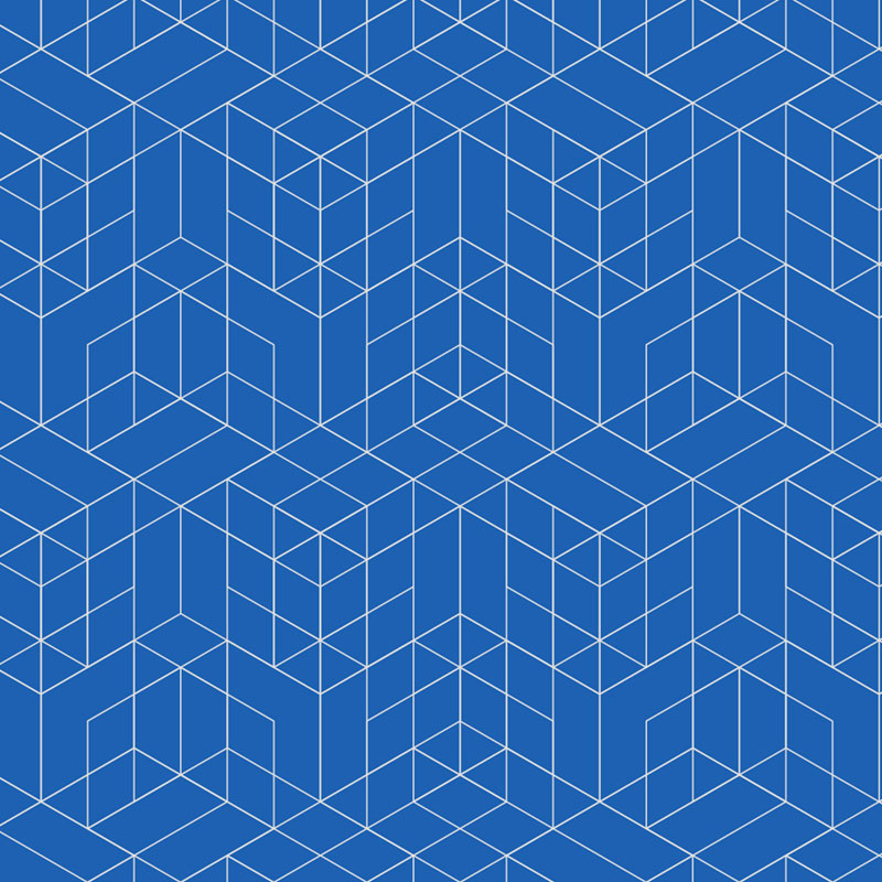
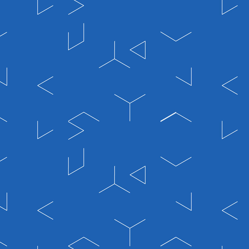
Patterns
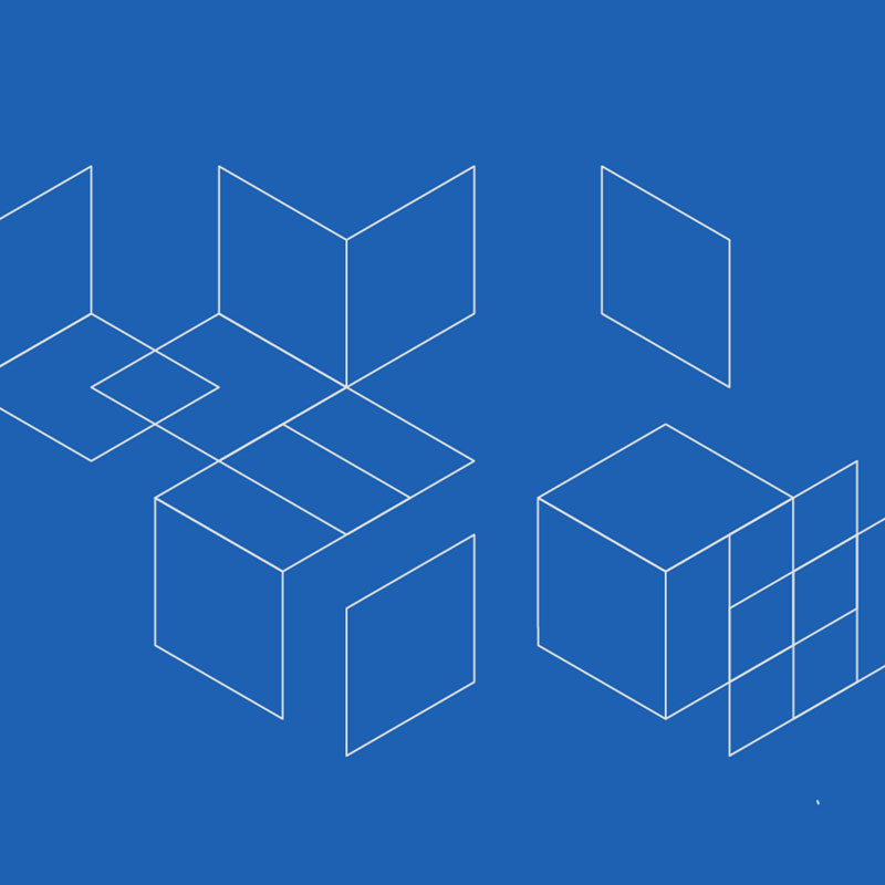
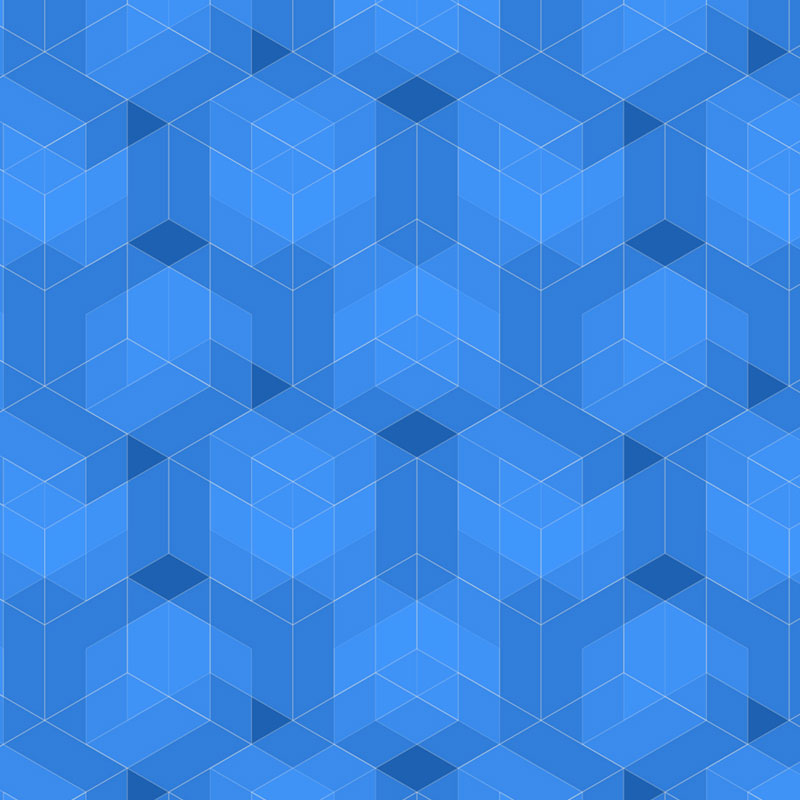
We built off of the isometric angles of the “L” mark, making them into a series of patterns that can be used on web, social, and print.


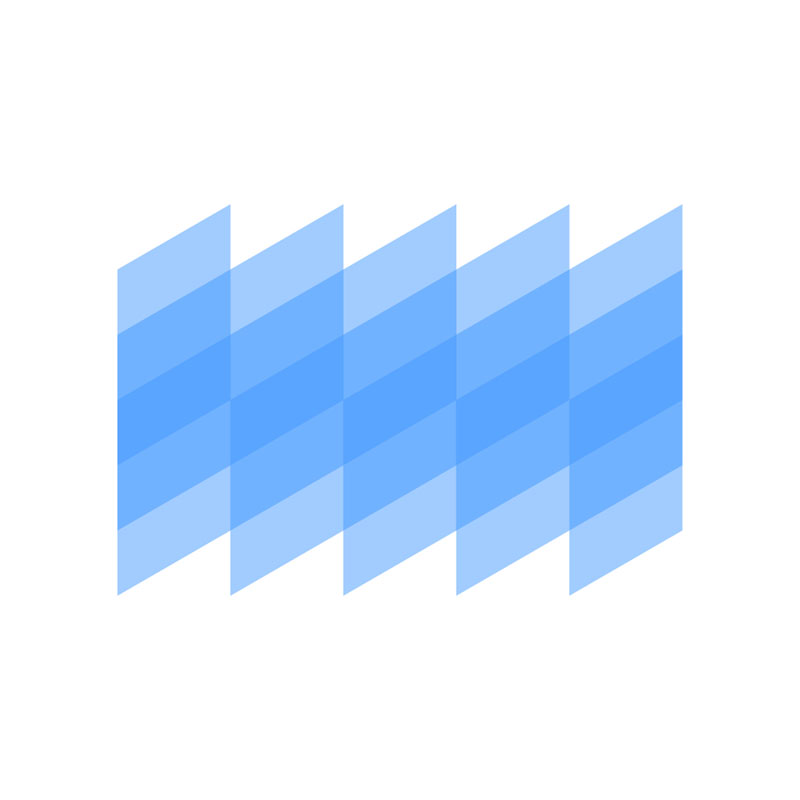


Color Palette
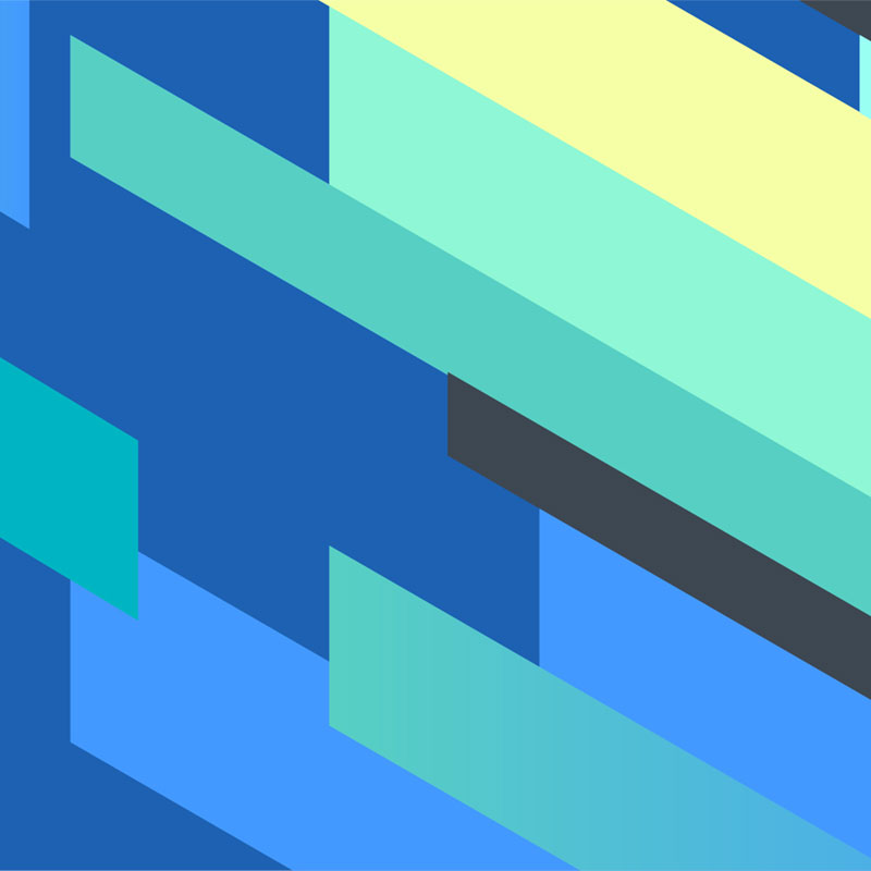
A completely new brand color palette was developed based on the concept of refracted light. The idea was derived from the sense of the word "lucid" that means "luminous."

Website Application
Shortly following the rebrand came the redesign of the website. You can see the live version here.


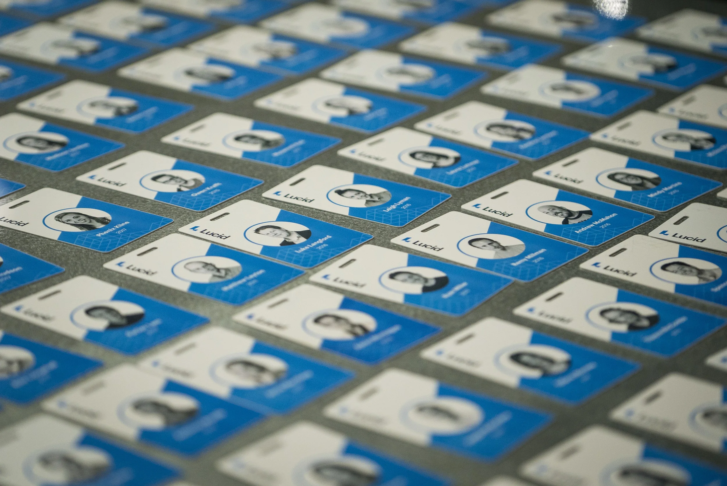
Additional Uses
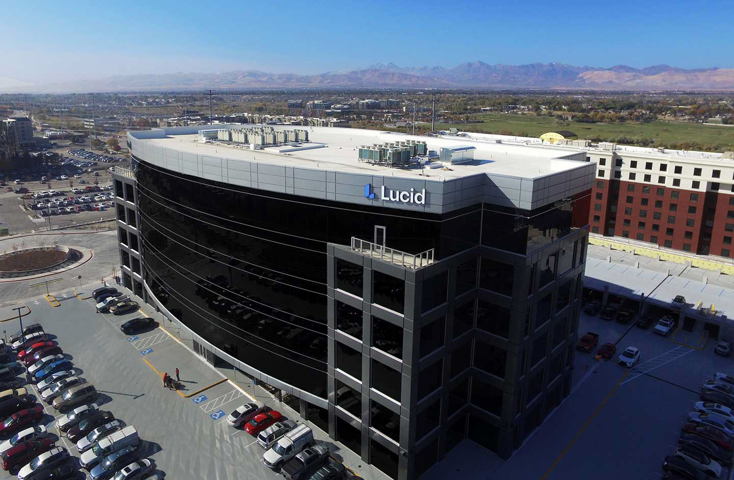
At the same time we developed the visual identity, we moved into a new office space. We applied the new identity on the building, in the building, on our ID badges, swag and many other places.


Design Notes
The Old Logo
The logo only existed in a horizontal format and was too wide for many situations. We found that both employees and users generally refered to our company simply as "Lucid.” So including “software” in the logo was unnecessary.
The mark itself was uninspired. When we showed the mark to people without the name next to it, they thought the “dots and bubbles” look meant it was a biochemical company or pharmaceuticals.
We found that both employees and users generally referred to our company simply as "Lucid." The old logo overly emphasizes the legal name. Perhaps most importantly, the old logo does not contain any valuable or memorable meaning apart from the name of the company.

New Logo
So the first thing we did was drop the “software” off of the logo. Dropping "software" from the logo makes it more compact and encourages people to use the simpler name. This instantly made the logo easier to produce and to scale in different situations.
The logo is based off of a isometric grid, but small changes needed to be made, like dropping the lower left corner of the L slightly below the baseline.


The old L mark contained an awkward empty space and was not very legible because it didn’t follow the traditional down and to the right L letterform. The new design is easily identified as an L and we made it more narrow to reduce the empty space.


The new isometric angled look also contains a concept that is meaningful to the company: progress.
Updated Blue
We updated the “Lucid Blue” to be less teal and more vibrant.

Credits:
Designed in collaboration with Rachel Ehlan, Mickey Martin & David Stauffer
Original descriptions written by Mickey Martin | Original Behance post here